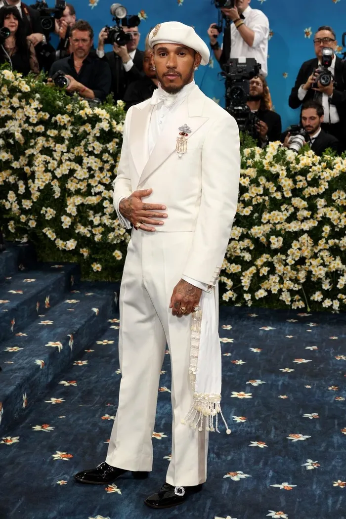
British race car driver, Lewis Hamilton, dressed in Pantone's colour of the year 2026 Cloud Dancer.
Image: Instagram/gq
In a time where most people are injecting bursts of colour into their lives, the 2026 Pantone colour of the year, “Cloud Dancer”, has many scratching their heads.
The Pantone Colour Institute describes Cloud Dancer as a lofty white neutral whose aerated presence acts as a whisper of calm and peace in a noisy world.
“Pantone 11-4201 Cloud Dancer symbolises a calming influence in a society rediscovering the value of quiet reflection. A billowy white imbued with serenity, it invites true relaxation and focus, allowing the mind to wander and creativity to breathe.”
In motion and in pause, Pantone Colour of the Year 2026, Pantone 11-4201 Cloud Dancer drifts between light and ethereal, a living calm that invites renewal, vision in serenity and creative release.
Since 1999, the Pantone Colour Institute has announced the specific shade for the upcoming year annually.
Pantone's trademarked system ensures the exact reproduction of precise colour shades across the print, manufacturing, marketing, and design industries.
According to the company, a team of "global colour experts" gets together to make the decision.
Pantone Colour Institute's vice-president Laurie Pressman said, "Cloud Dancer signifies our desire for a fresh start".
"Peeling away layers of outmoded thinking, we open the door to new approaches. An airy white hue, PANTONE 11-4201 Cloud Dancer opens up space for creativity, allowing our imagination to drift so that new insights and bold ideas can emerge and take shape," said Pressman.
The announcement of Cloud Dancer has been met with rather eyebrow-raising comments from critics, who are just not feeling the colour, with some labelling it as “tone deaf”.
“Choosing an almost-white shade as the Color of the Year right now is hard to separate from the broader cultural context we’re living in. When white supremacy is resurfacing loudly in national leadership and policy, elevating ‘white’ as the symbolic color of the year feels painfully tone-deaf,” wrote Mathew Boudreaux.
“Color choices don’t exist in a vacuum - they reflect who was in the room, whose perspectives were missing, and what messages get unintentionally reinforced. I wish this decision showed more awareness of the world marginalized communities are navigating every day.”
Jeanine Caldwell Gaston expressed their disappointment in Pantone’s colour choice.
“White, by definition, is the absence of color. Pantone is a color company. This choice shows a stunning lack of creativity and a complete disconnect from the artistic and design communities.
“In a moment when color is used to express culture, diversity, emotion, and innovation, choosing a white-based shade feels tone-deaf at best. At worst, it unintentionally aligns with cultural and political symbolism that many of us find deeply troubling.
“I cannot overstate my dismay and disappointment I am in this decision. It misses the mark so dramatically that it makes me question who is leading these conversations at Pantone — and whether they understand the creative world they claim to represent.”
IOL